How to Create a Cohesive Instagram Aesthetic
Between weddings, engagement sessions, and boudoir sessions, Arturo and I receive over 200 inquires a year! Instagram has been one of the main ways inquiring (and booking!) clients have found us. It’s been a great and free way for Arturo and me to share our portfolio, while also showing we’re able to create a consistent body of work. Instagram also has allowed us to connect and establish relationships with our clients and fellow industry colleagues!
Being that we live in a day where social media provides plenty of inspiration for consumers in so many different industries, more and more people are turning to Instagram to find or discover their new favorite brands and businesses. When someone lands on your Instagram profile the first thing they see on your page is your grid, so it’s important to make a good impression! If they feel like your feed is visually appealing, they’re much more likely to hit that “Follow” button. Soon after I started using Instagram to market our business, I realized that I’d probably be able to grow my following and attract more potential clients if I had a cohesive Instagram grid. And it worked! Is creating an Instagram aesthetic necessary to succeed in business? Of course not. However, since photography is obviously very visual, it has certainly helped to build our client base.
Whether you’re a small business owner looking to improve your Instagram marketing or you want to have a visually appealing Instagram grid for your own personal goals, below are some times on how to create a cohesive aesthetic!
Find Inspiration
Think about your top 3 favorite Instagram accounts that you follow. Visually speaking, what is it about their feed that you like? Is the photography or imagery style bright and airy? Dark and moody? Vibrant and colorful? What sort of pattern do they follow, if any? What mood or emotions to you pick up on as you scroll through their feed? When looking for inspiration, consider what styles and colors you want to represent your brand.
Decide on a Style & Color Palette
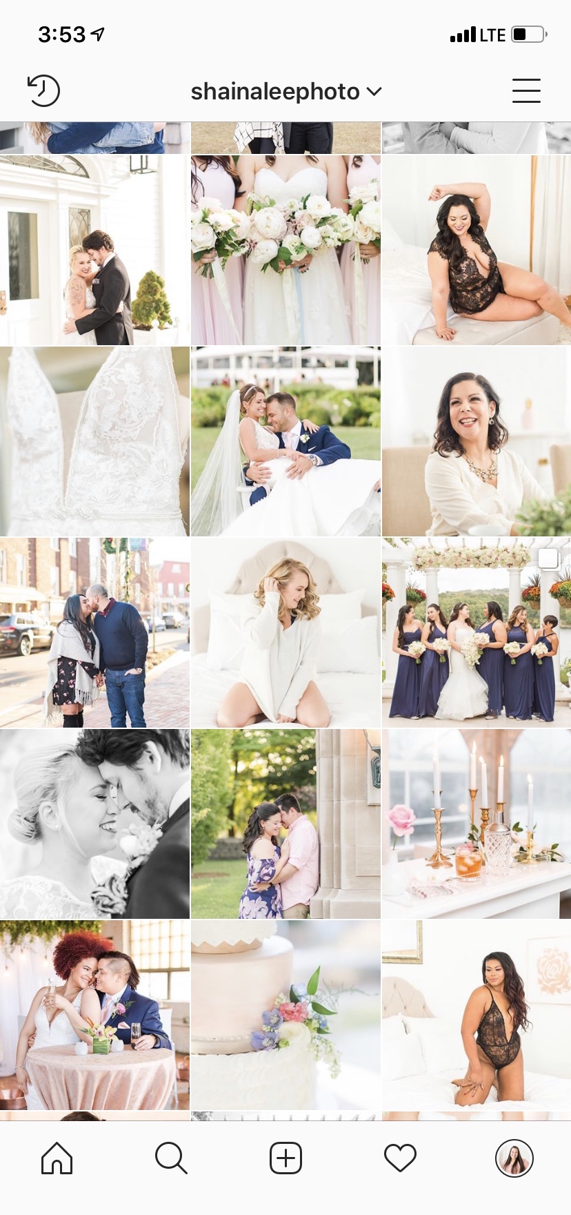
Since our editing style is bright and airy with a pop of color, my Instagram grid naturally fell into that style. Much of what I post on Instagram is taken in natural light, because that’s my favorite light to work with! It also helps me stay true to the “bright and airy” vibe while marketing to people who are searching for that style of photography for their wedding or boudoir images. Whatever style and color scheme you choose, just remember, consistency is key!
Another thing to consider is what you want your customers and clients to feel when they think of you or your brand. From the very moment I started building the Shaina Lee Photography brand, I knew I wanted our clients to feel the joy and romance in our portfolio. In almost all of the portraits I post, you’ll see my clients smiling, laughing, or showing affection to one another.
Mix Up Your Imagery
When done correctly, mixing up your photos and images definitely helps to add visual interest to your Instagram grid. Being a wedding and engagement photographer, I like to post a variety of images showcasing portraits from these events and sessions. I try to mix it up between tight, close up portraits and ones that are wider shots that include the scenery around the couple. Due to my detail-loving heart, I like to sprinkle in wedding details too (think florals, wedding cakes, signature cocktails, etc)! I don’t share a ton of my boudoir portfolio on Instagram, but I add in a few boudoir portraits in every once in a while as well.
Plan Your Grid
Remember, consistency is key! My biggest life saver for Instagram marketing and planning out my grid has been Later. I’ve been using it for the past year and a half, and it has allowed me to visually plan and schedule my Instagram posts. I’ll usually plan 1-2 weeks worth of content in advance, and it’s been such a time saver! It has also helped me to post much more consistently, which means getting more of my content into the Instagram world and in turn creating more inquiries! Later allows me to write my captions and schedule each post for a later date and time. I have the Later app downloaded to my phone, which sends me a notification when I have a post ready to be published. Instead of sitting on my phone for 15 minutes trying to think of a caption and hashtags, I can post my photo in a matter of seconds and return to whatever I was doing. The best part? It’s FREE for up to 30 posts a month, which translates to about 1 post per day. Paid plans are also available with additional features for a very affordable price.
I hope you found these Instagram-planning tips helpful! Before you know it, you’ll be creating a beautiful and true-to-your-brand (or true-to-you!) Instagram aesthetic. Comment below with your favorite Instagram feeds so others can gain inspiration!
If you haven’t already, be sure to connect with Arturo and me on Instagram (@shainaleephoto & @arturodiaz.slp). We always love making new friends in the photography and creative small business industries!
ABOUT THE PHOTOGRAPHER
Shaina Diaz is one half of a husband and wife team at Shaina Lee Photography serving couples in Connecticut, New York, Hawaii, and worldwide. She has been photographing weddings since she was 20 years old and a sophomore in college. Shaina loves each wedding season a little more than the previous one, and is excited to share her knowledge with other wedding and boudoir photographers!


